Hey frontenders, let’s talk about accessibility?
Talking a little bit about the theory, how to implement and some tips
Introdution
When I started in this world of software development I had not ideia what accessibility was. It was just a topic that seemed really far from my knowledge and my dayly life, but sometimes I faced with something about it (Linkedin, Medium or job).
Everytime that I heart about it, the speeach was always the same. The why was that we should implement accessibility because some porcentage of theh population have any type of deficience or because this number is growing every year.
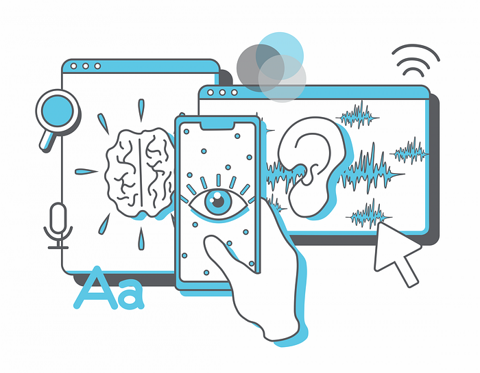
This is not the quantity approach that I would like to bring. Accessibility, for me, means that an application must be ✨ accessible ✨ and end. For the visually impaired, for the elderly grandma, for the autistic person, for the colorblind, for the student, the employee, and the unemployed. In short, to everyone. Accessibility is about democratizing information.
Accessibility is the ability for everyone, regardless of their condition, to access something.
I say that because accessibility is 100% related to the user experience, the famous UX. An accessible application means that it is easy to use, direct in its intentions, clear about the ideas and elegant in the implementation.
In the end, usability and accessibility are twin sisters.
If you’re not thinking about accessibility in your implementations today, start thinking about it, because it will certainly up the level of your deliveries.
“But dude, how I make my deliveries accessible”?
Making a accessible screen is not a monster as it may seem at first glance. Let’s list points and talk about:
HTML
This one is pretty objetive. Use it more correctly possible, like, respecting the semantic of the elements and their properties.
Respect the concepts, attributes, and properties of tags. Screen readers, screen magnifiers, and other assistive tools rely heavily on HTML to guide them.
Colors and contrast

Be careful with colors and their contrasts. Try to define the beginning and end of colors, and provide enough contrast to make them well-defined. This ensures that people with low vision or color blindness can see properly, and in general, makes it easier for everyone.
Images
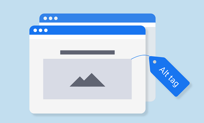
Screen readers do not read images, so describe the image using the “alt” attribute of the “img” tag.
If the image is not important and is just decorative, leave the “alt” attribute blank. This way, the screen reader will know to skip the image.
Videos
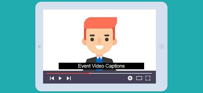
You know that really cool video? Don’t forget to make it possible to watch it with subtitles as well.
Subtitles are really importants.
Hierarchy of texts
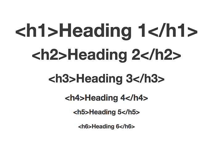
HTML has a hierarchy for text that must be followed. By respecting the hierarchy, you will make it clear that your interface has a reading flow to be followed.
Use the title, subtitle, paragraph, etc. tags appropriately.
Keyboard navigation
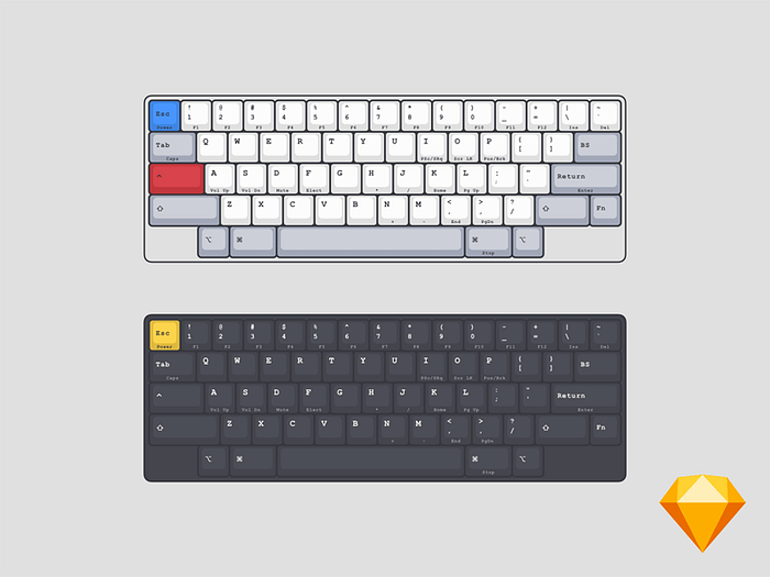
It is extremely important that your application can also be used by those who have some motor difficulty and therefore use the keyboard to navigate.
Maintain a hierarchical structure of HTML. Respect the HTML tags, so will be possible to use the keyboard to navigate through the application.
Links

Referring to the “Keyboard navigation” topic, links should be navigable so it will be easy to navigate through them using the tab key.
In addition, make sure that your link looks like a link (lol).
Forms

Forms have evolved towards a minimalist approach, which is good… but it can also be bad. Don’t hide the labels and boundaries.
Put labels on the fields to identify them, and use visual stuff (colors, messages, icons, etc.) to indicate the state of the form and notify the user of requirements, errors, and successes.
Fonts
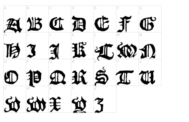
Fonts can be a tricky subject. Please use common sense when choosing a font. A heavy and complex font will only make reading more difficult.
In addition, pay attention to the font sizes and line spacing, you don’t need to make everything small.
Linguagem
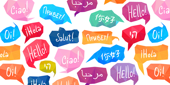
A language understood by all is ideal. Avoid difficult messages and complicated words. Write simply! Be clear!
Focus
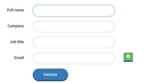
Indicate the element that has focus, make this information visible using visual indicators.
ARIA
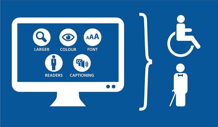
ARIA is a specification controlled by the W3C. ARIA is an extension of HTML that defines attributes, properties, and states to assist and improve the experience with assistive technologies.
This topic is extremely important, take a look in the documentation.
Landmarks
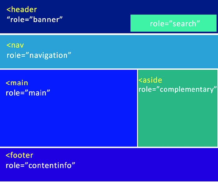
Landmarks works like reference points. Their usage is to identify important points in the application to allow the user to reach them more easily.
To use it, just include the “role” attribute in the element.
Javascript events
When possible, use JavaScript event handlers that are device-independent.
An example is the onMouseOver event, which is related to the mouse (and who doesn’t use a mouse?), in this case, change it to onFocus.
15 tips and good practises
- Set the language of your application — and elements when it needs to be more specific;
- Icon font sources are not good for accessibility — try to choose SVG;
- Make links self-descriptive and easy to understand — avoid “click here” text;
- Justified text can be problematic when reading;
- Group radio buttons together;
- Do not autoplay videos (especially with sound) and musics. It’s annoying and can scare people;
- Do not use deprecated elements — such as summary (table), name (a), and border (img);
- If adding a title to a table, use the caption tag inside the table tag — it makes it easier for screen readers;
- Use the title tag properly — it’s useful for screen readers;
- Avoid using images with text inside the image — opt for overlay when applicable;
- Be aware of loop animations — they can be a distraction for some people;
- Windows, dialog boxes, modals, etc. should be able to be closed with the escape key;
- Do not disable zoom — many people use it to feel more comfortable;
- Avoid using hyphens in sentence structure;
- Avoid abbreviations.
Truths
a) Accessibility is not an impediment to innovation
Innovate. Be different. It is possible to be unique and still accessible.
b) Color is not the only way to convey information in a clean manner
Using color is not the only way to convey interactive information. Also use visual indicators and have a secondary communication channel.
c) Why be afraid to use white space?
Don’t keep everything too close, use whitespace to mark boundaries (simple!). Don’t be afraid to use clear spacing.
d) Performance also means being accessible
Not everyone has a fast internet.
e) ARIA serves to improve the experience
The objective of ARIA is to improve the experience, not to keep fixing accessibility issues caused by poorly written HTML.
f) What about responsiveness?
Responsiveness means making sure that a website or application is accessible on devices of different sizes. Make sure to test for it!
g) Be careful when using “x” and “@” for gender-neutral language
Screen readers may not know how to pronounce the word correctly. Additionally, not everyone may know how to read these symbols properly, making the text more complex and difficult to understand. There are techniques for non-sexist writing that can be used instead.
h) Are there people with disabilities in your company?
If the answer is no, maybe it’s time to think about why there isn’t and try to change that scenario now! If yes, get closer! Coexistence generates knowledge, empathy and friendship.
i) Unfortunately, you won’t be able to provide a perfect experience for everyone
But do your best!
Tools to help you
axe — Web Accessibility Testing
Accessibility checker for developers in Chrome.
Lighthouse
Open-source automated tool to improve performance, quality, and accessibility of your web applications.

BORREAU OF INTERNET ACCESSIBILITY — a11y Tool And Services for WCAG 2.0 Compliance
Analysis of the accessibility of your website.

WAVE Web Accessibility Evaluation Tool
Set of tools that helps authors make their web content more accessible for people with disabilities.

NVDA
Free screen reader.

Conclusion
I hope I have been able to provide some information, given some insight, and presented an important topic in a good way.
Of course, this is a huge topic and the intention is not to know everything about accessibility and how to implement it right away, but to know that it exists. It is important, and it must be present in applications. You will learn the rest gradually.
If you've enjoyed, consider buying me a coffee as a token of appreciation.
Thanks a lot for reading!

